“An image reflected in a mirror, a rainbow in the sky,
and a painted image.
Make their impressions upon the mind,
But in true nature are other than what they seem.
Look deeply at the world, and see
An illusion, a magician’s dream.”
Dalai Lama VII: “Song of the Immaculate Path”
Art is not reality. Art is an illusion-a human interpretation of a past human perception that then influences future human perception.
Understanding the artistic formal elements of photography enables a viewer a visual appreciation of images. Rather than simply focusing on the subject and context of a photograph, the viewer will discern how line, light, and color form a composition.
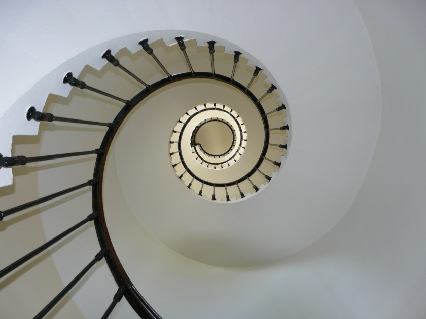
LINE
“A line is an identifiable path created by a point moving in space. It is one-dimensional and can vary in width, direction, and length. Lines often define the edges of a form. Lines can be horizontal, vertical, or diagonal, straight or curved, thick or thin. They lead your eye around the composition and can communicate information through their character and direction.” – The J. Paul Getty Museum
“Line is the path created when an object moves from one point to another. In the visual arts, lines are made when you draw or paint marks on a paper, canvas, or when materials such as wood, glass and metal are bent or shaped. Lines are also made by photographers or filmmakers when they choose how to angle their cameras or compose their shots. Lines can be horizontal, vertical or diagonal, straight, curved or free-form. They can be thick or thin, light or dark. Sometimes one line can be all of those things. Lines can be described in many ways — dashed, dotted, rough, smooth, zig-zag, implied.” KQED Art School

SHAPE
“Shape has only height and width. Shape is usually, though not always, defined by line, which can provide its contour.” The J. Paul Getty Museum
“Shape is the two-dimensional, or flat, area defined by the borders of an enclosing outline, or contour. Shape can be geometric, biomorphic (suggesting living things), closed, or open.” Marilyn Stokstad

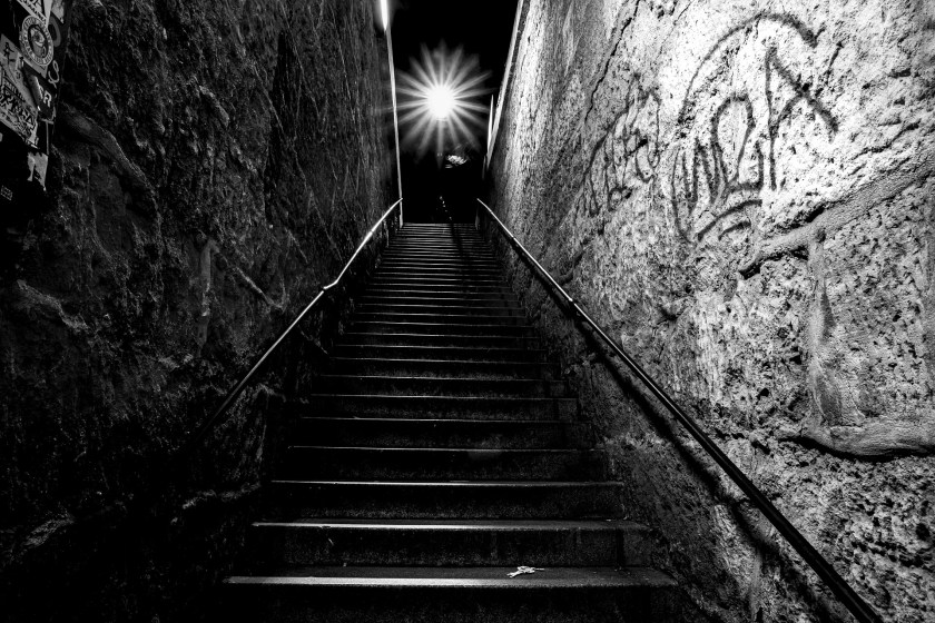
LIGHT/VALUE
“Value defines how light or dark a given color or hue can be. Values are best understood when visualized as a scale or gradient, from dark to light. The more tonal variants in an image, the lower the contrast. When shades of similar value are used together, they also create a low contrast image.” New York Times

FORM/SPACE
“Real space is three-dimensional. Space in a work of art refers to a feeling of depth or three dimensions. It can also refer to the artist’s use of the area within the picture plane. The area around the primary objects in a work of art is known as negative space, while the space occupied by the primary objects is known as positive space.” The J. Paul Getty Museum
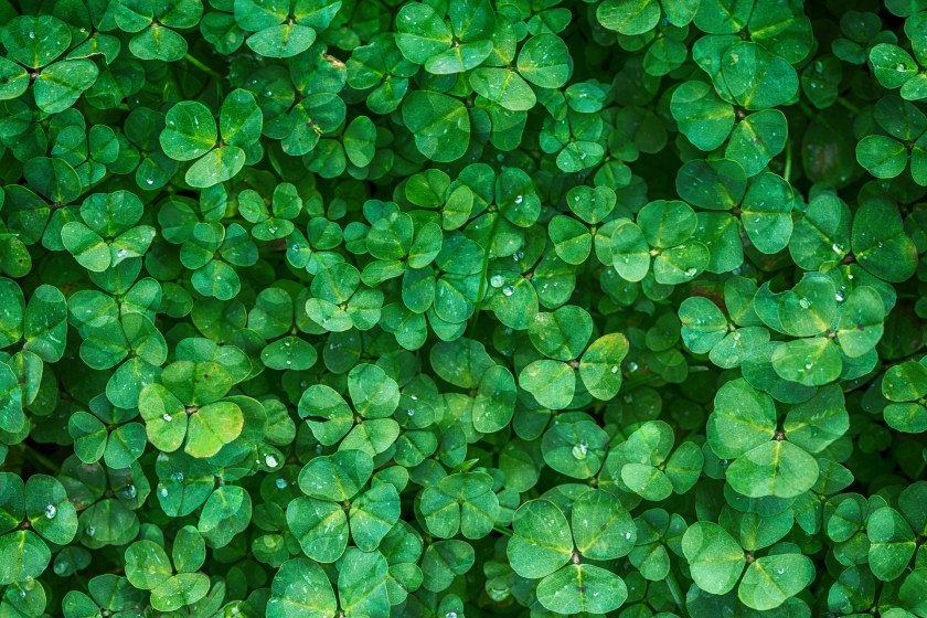
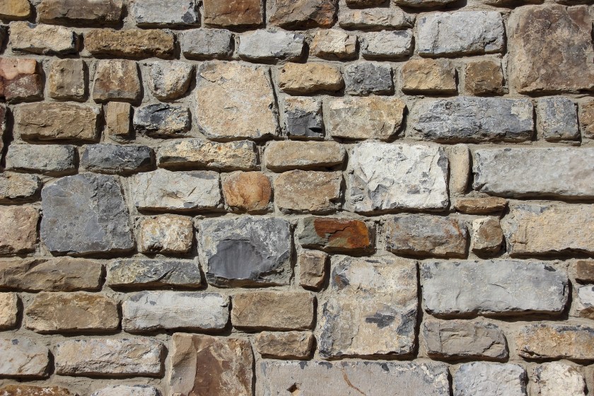
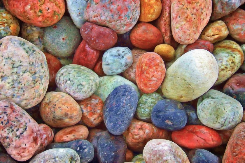
TEXTURE
“The surface quality of an object that we sense through touch. All objects have a physical texture. Artists can also convey texture visually in two dimensions. In a two-dimensional work of art, texture gives a visual sense of how an object depicted would feel in real life if touched: hard, soft, rough, smooth, hairy, leathery, sharp, etc. In three-dimensional works, artists use actual texture to add a tactile quality to the work.” The J. Paul Getty Museum
COLOR
“Light reflected off objects. Color has three main characteristics: hue (red, green, blue, etc.), value (how light or dark it is), and intensity (how bright or dull it is). Colors can be described as warm (red, yellow) or cool (blue, gray), depending on which end of the color spectrum they fall.” The J. Paul Getty Museum
Artists make reference to a Color Wheel to think about how colors interact with one another. The three primary colors are pure, meaning they can not be created by mixing other colors. The three primary colors are blue, red, and yellow. Secondary colors are the result of mixing two primary colors. For example, primaries red and yellow result in secondary orange. tertiary colors result when when one primary is dominant over the other primary, resulting in colors such as blue green or blue violet.
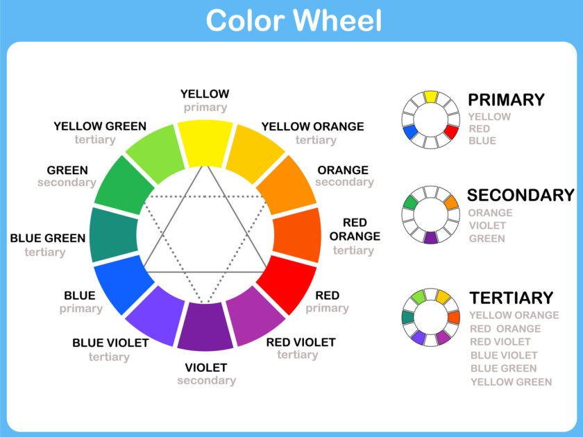
Orange, red, and yellow are considered warm colors, while blue, green, and violet are cool.

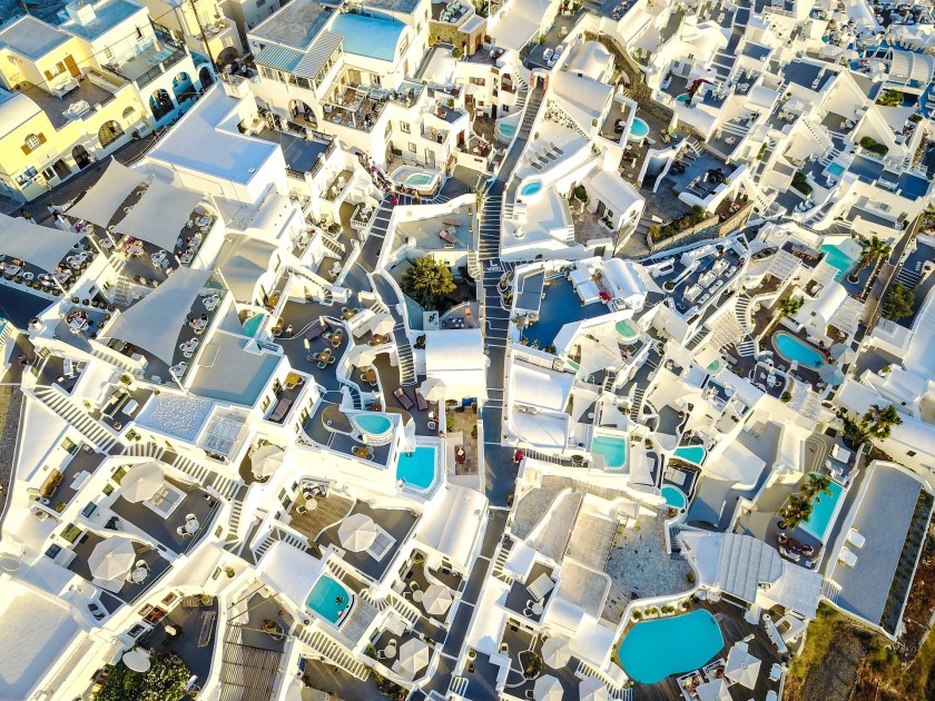
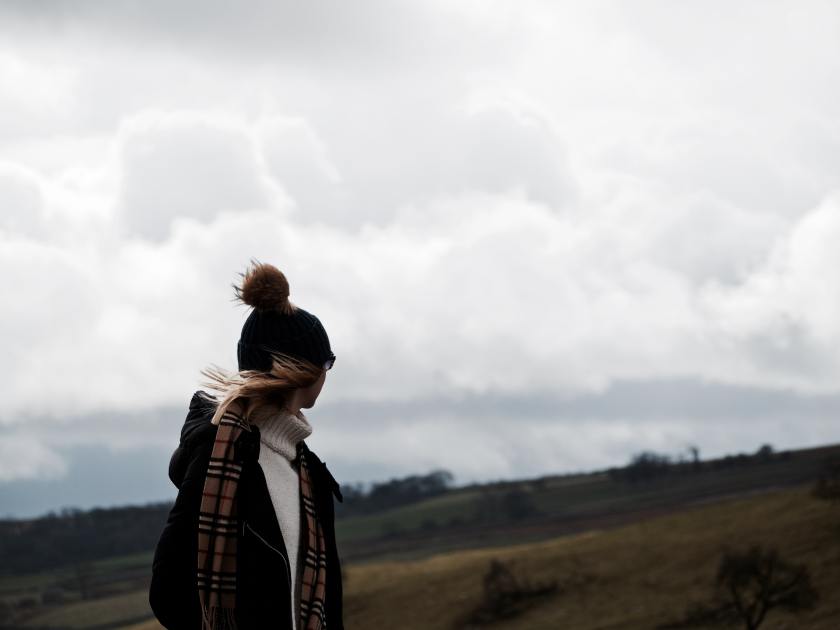
Analogous colors are three adjacent colors on the color wheel. Analogous colors generally provide a cohesive, soothing impression. The photo above is comprised of the analogous colors of blue-violet, violet, red violet.
Examples of analogous colors are:
Blue, Purple, Red
Red, Orange, Yellow
Blue, Green, Yellow

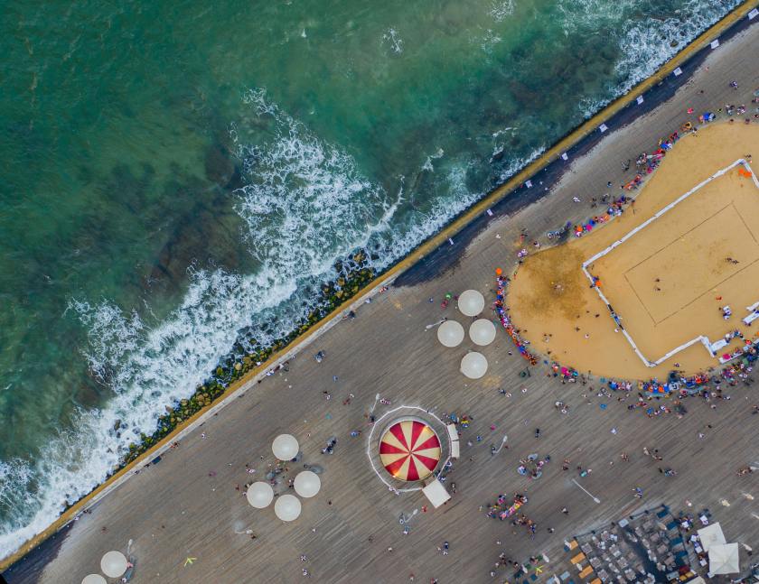
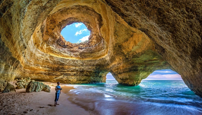
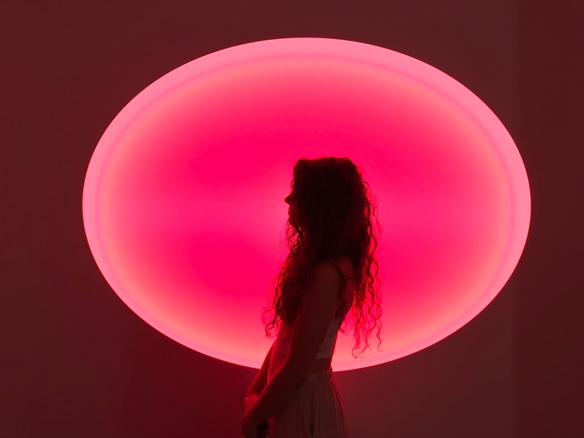
Complementary colors lie directly opposite of one another on the color wheel: blue and orange, violet and yellow, red and green. Generally complimentary colors create a jarring effect, making one another seem more intense . The blue and orange in the photo above create a clear distinction between sea and sky.
Examples of complementary colors are:
Blue & Orange
Red & Green
Yellow & Purple
COMPOSITION
Composition is the arrangement of formal elements within a work of art. An interesting exercise is for a viewer to ignore the subject and context of the work and just analyze an artwork while going through the formal elements one after the other.
Where do the lines move your eye? Is the artwork comprised of biomorphic or geometric shapes? Is the lighting heavily contrasted or neutral? Does the lighting reinforce the form to create an illusion of three-dimensionality on a two-dimensional surface? What types of textures are implied in the artwork? Is the color arrangement predominantly analogous or complementary?
A good composition constantly moves the viewer’s eye throughout the image but never off the edge of the artwork.
COMPOSITION EXAMPLES
There are many forms of composition. All types of composition are equally effective when used creatively. The most important aspect of composition is not which method the artist uses, but rather that the artist is aware of composition when creating a work.
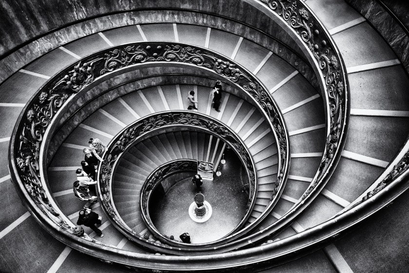
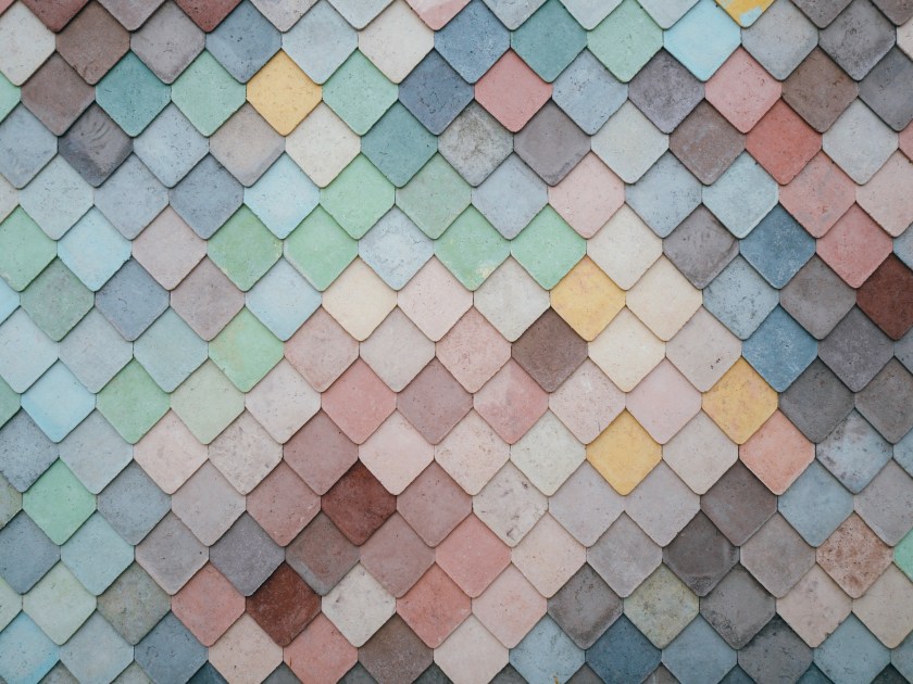
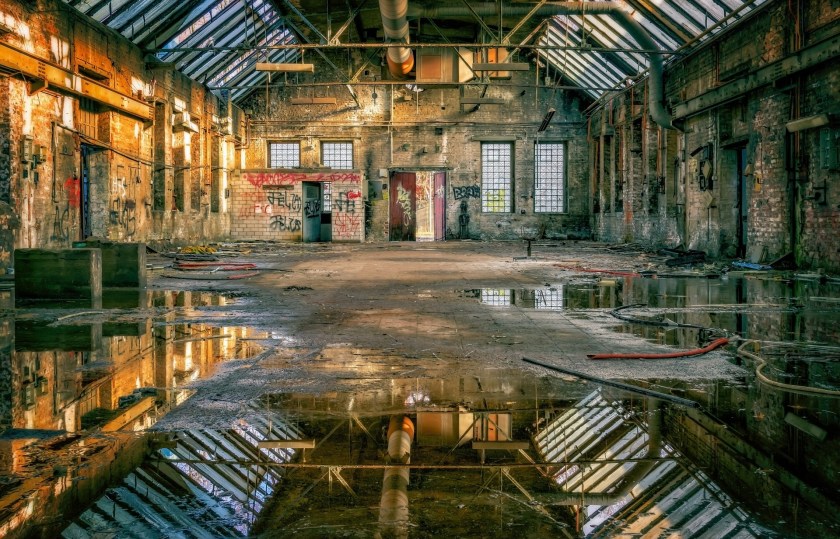
ALLOVER COMPOSITION
The art critic Clement Greenberg described the Abstract Expressionists painters has creating a new type of composition for oil painting. “This tendency appears in the all-over, “decentralized,” “polyphonic” picture that relies on a surface knit together of identical or closely similar elements which repeat themselves Without marked variation from one edge of the picture to the other. It is a kind of picture that dispenses, apparently, with beginning, middle, end…The very notion of uniformity is antiaesthetic. Yet many “all-over” pictures seem to succeed precisely by virtue of their uniformity, their sheer monotony. The dissolution of the pictorial into sheer texture, into apparently sheer sensation, into an accumulation of repetitions, seems to speak for and answer something profound in contemporary sensibility.”
BALANCED COMPOSITION
A balanced composition is different than a symmetrical composition. A balanced composition equally balances an image with differing elements on either side of the composition.
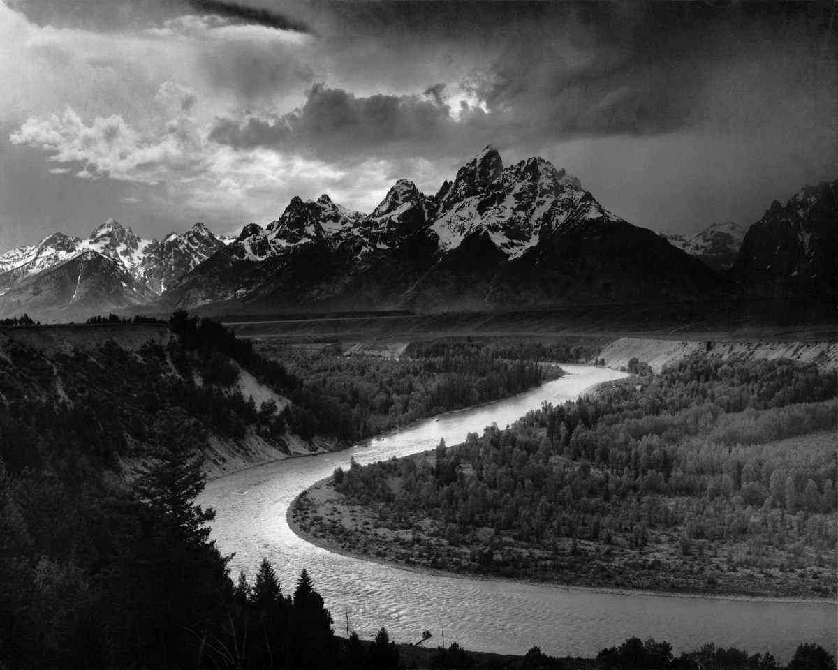
DIAGONAL COMPOSITION
An effective diagonal composition is difficult to create, but one of the most compelling when pulled off.
FRAME IN A FRAME COMPOSITION
A frame usually serves a border between the real world and the window of illusion of the artwork. Artists often place a frame within the frame of the artwork to create an illusion of enhanced depth.
POSITIVE AND NEGATIVE SPACE COMPOSITION
“Positive space refers to the subject or areas of interest in an artwork, such as a person’s face or figure in a portrait, the objects in a still life painting, or the trees in a landscape painting. Negative space is the background or the area that surrounds the subject of the work.” Whitney Museum of American Art
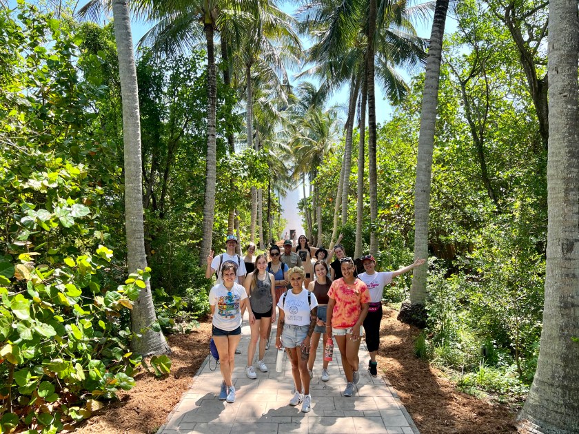
RULE OF THIRDS COMPOSITION
Rule of Thirds: “In photography, the rule of thirds is a composition type in which a photo is divided evenly into thirds, horizontally and vertically. Then, with the imaginary 3*3 grid of 9 segments formed by two horizontal and vertical lines each, the image’s subject is positioned at the intersection of those dividing lines or along with one of the lines itself.” Nashville Film Institute
SYMMETRICAL COMPOSITION
Pure symmetry rarely, if ever, exists in the real world. A symmetrical composition balances a composition with nearly similar halves.
TRIANGULAR COMPOSITION
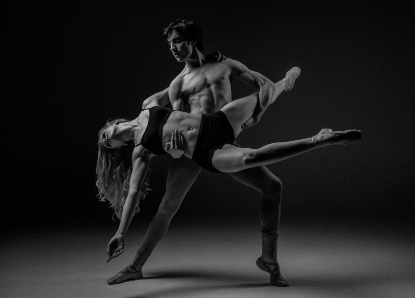
Triangular compositions create a dynamic of movement absent from the predictability of other compositions.
REFERENCES AND FURTHER READING
Dalai Lama VII Bskal-bzaṅ-rgya-mtsho. Meditations to Transform The Mind. United States, Shambhala, 1999.
Farr, Kristin. “Analyzing the Elements of Art | Five Ways to Think about Space.” The New York Times, The New York Times, 3 Jan. 2018, https://www.nytimes.com/2018/01/03/learning/lesson-plans/analyzing-the-elements-of-art-five-ways-to-think-about-space.html.
Mundt, Ernest. Art, Form, and Civilization, Berkeley: University of California Press, 1952. https://doi.org/10.1525/9780520349834
Stokstad, Marilyn, et al. Art History. Pearson/Prentice Hall, 2005.

EDITOR & LAST UPDATE
John William Bailly 23 August 2023
COPYRIGHT © ALL RIGHTS RESERVED
